You’re not supposed to show how the sausage is made but thought it might be interesting to show how the poster for the MTA Art Card Program was created.
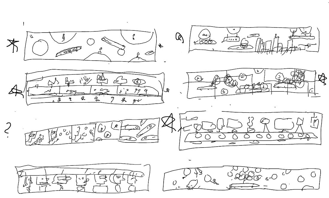
The first round are quick brainstorming sketches which are broken down to basic shapes to see if they can work compositionally. Since they are only for me, the drawings are very illegible. Starred ideas are developed further.
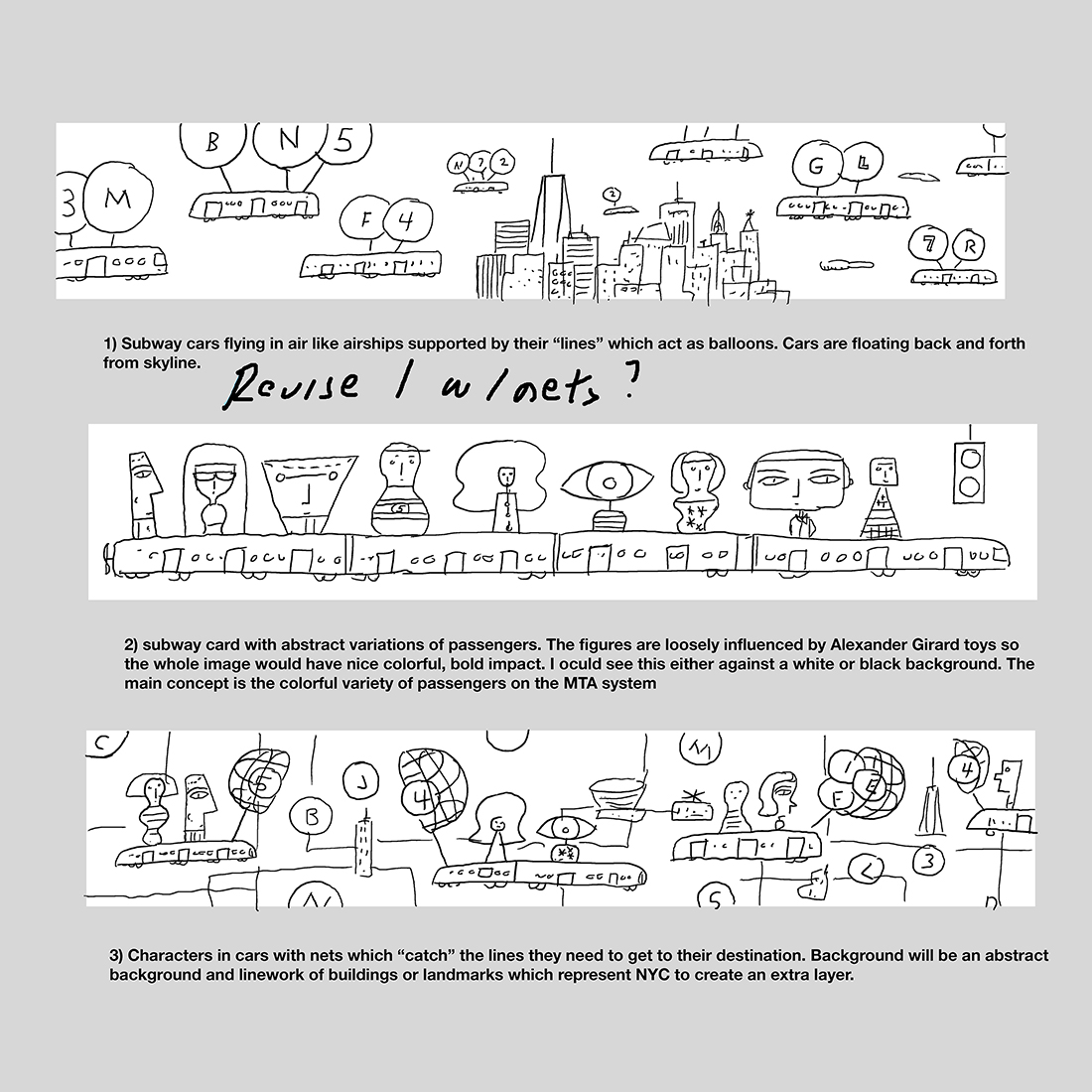
Once refined, the three strongest ideas are sent. The ideas are distinct and strong enough so I’m happy to take any direction to final. Every creative jokes that you never submit an idea you hate because that’s the one which will be picked. Amy Hausmann who is the AD for the program liked all three ideas but really liked the top idea. They had also commissioned two other posters which were character based so the first idea was a nice change of pace. The biggest irony is I consider myself a character illustrator but was happy to try this direction. Amy and her team also liked the basket catching element of the third sketch and asked if I could play around with it for the first idea. They emphasized that if it didn’t work for me they were happy with the original sketch. I thought it could work and provided a another sketch with their suggestion.
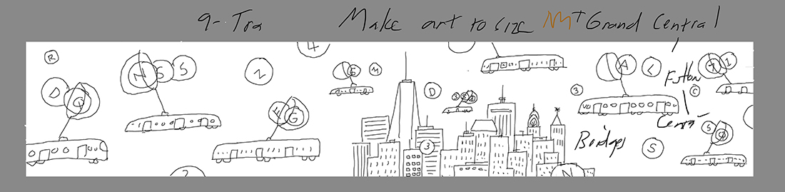
We were pleased with how the baskets worked with the first sketch. It seemed more fanciful. Amy had comments which I wrote on the sketch before going to the next stage. Notes from the MTA are suggestions and I found them to be very helpful. You never had the feeling they were commanding you to make a change.
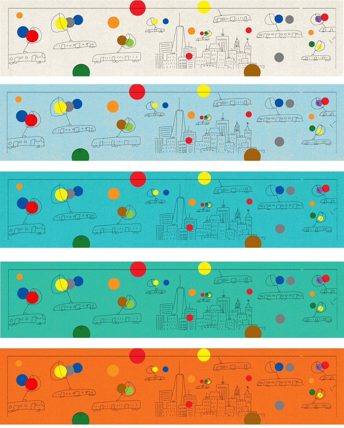
Since this was a complex project from a color standpoint, I suggested submitting tests because the color circles correspond to subway lines. They liked the middle test and asked me to keep in mind that newer trains have a light blue interior. I’m familiar with the new trains and it helped with visualizing how the final poster should work.
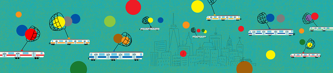
This is work in progress which was shared with Amy and the team so they could have a feel for the texture. The color shifted more towards blue in the final. Amy asked about extending the cityscape and I thought it was a great idea. One day while riding the PATH New Jersey train, the view of the city from the train hit me with the solution for extending the skyline. The main goal was to extend the cityscape while not making the image cluttered.
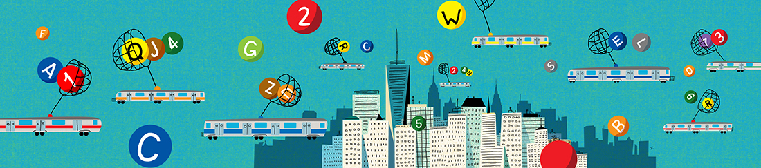
And here’s the final poster. Amy mentioned the W and remodeled Q lines were opening the same year as this poster so i made sure they were the larger lines featured. While showing a preview of the poster to a friend, she noticed I had left out a line so I made sure to put it in before submitting to the MTA. This project was a great experience where having a team you could trust improve on an original idea.